01
UX structure and user flows
We defined journeys, information architecture and navigation to organise the giving experience.

We design identities, interfaces and digital experiences that connect strategy, aesthetics and intent.
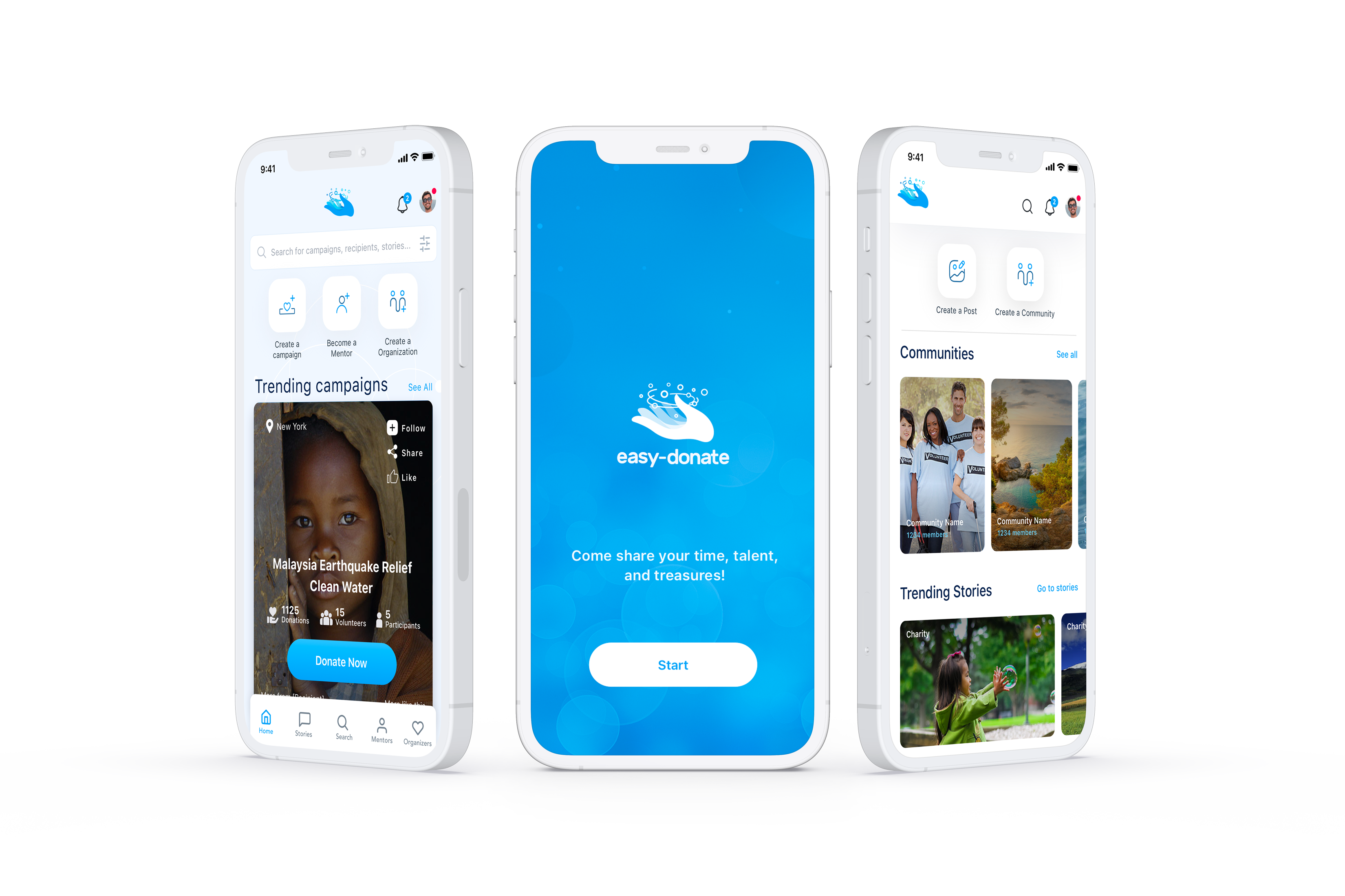
More than 110 screens turning digital giving into a clear, human and trustworthy experience.
Easy Donate is a platform created to simplify the digital giving process. The heart of the project was the UX/UI design of a complete mobile app, from flow structure and wireframes through to the visual design of more than 110 screens.
From that central experience, we also developed the logo concept, visual brand system and an extension of the experience into the dashboard and website.
At LIMINAL, we built an experience designed to reduce friction, build trust and connect people with causes in a simpler, clearer and more human way.
Easy Donate needed an experience able to turn a deeply human action into a clear, accessible process that is easy to complete.
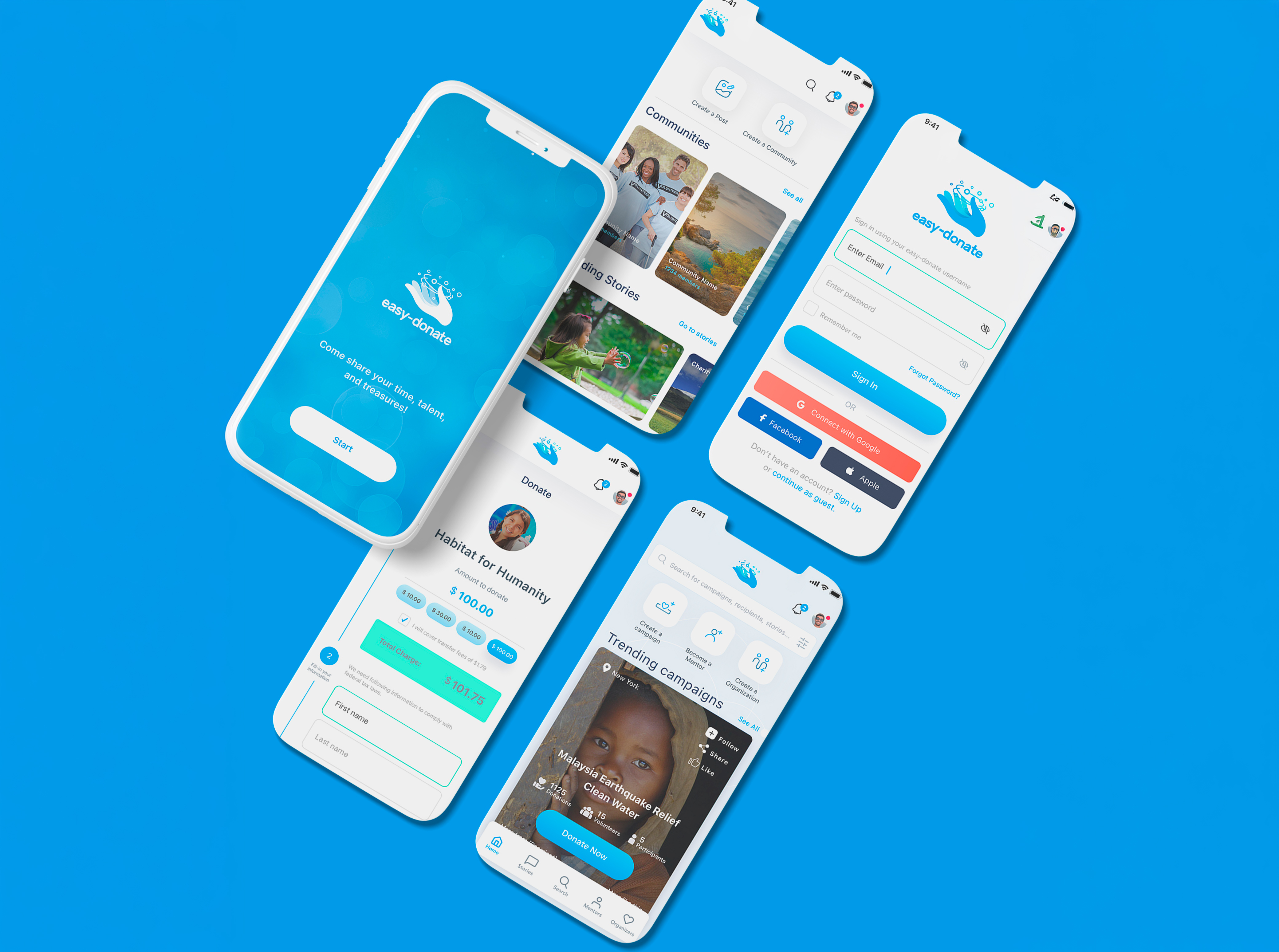
We designed an app where every screen helps users discover causes, understand campaigns, complete donations and manage information securely.
The goal was not simply to create an appealing app, but a complete product experience with structure, visual clarity and trust from the first interaction.
Giving is a human, sensitive and meaningful action. In an app, that intention can lose momentum when the journey is confusing, information is poorly organised or the user does not feel trust.
The app needed to feel simple, but not basic; emotional, but not informal; trustworthy, but not cold. It also had to support discovery of causes, campaigns, donations, profiles, history, states and confirmations.
Before visual design, we worked on information architecture, core journeys, content hierarchy and navigation.
Every decision sought to answer one core question: how can giving be easier, clearer and more trustworthy in a digital environment?
Wireframes made it possible to validate journeys, organise priorities and ensure continuity from discovering a cause through to giving, profile and information management.
The experience needed to work as a connected system, not a collection of isolated screens.
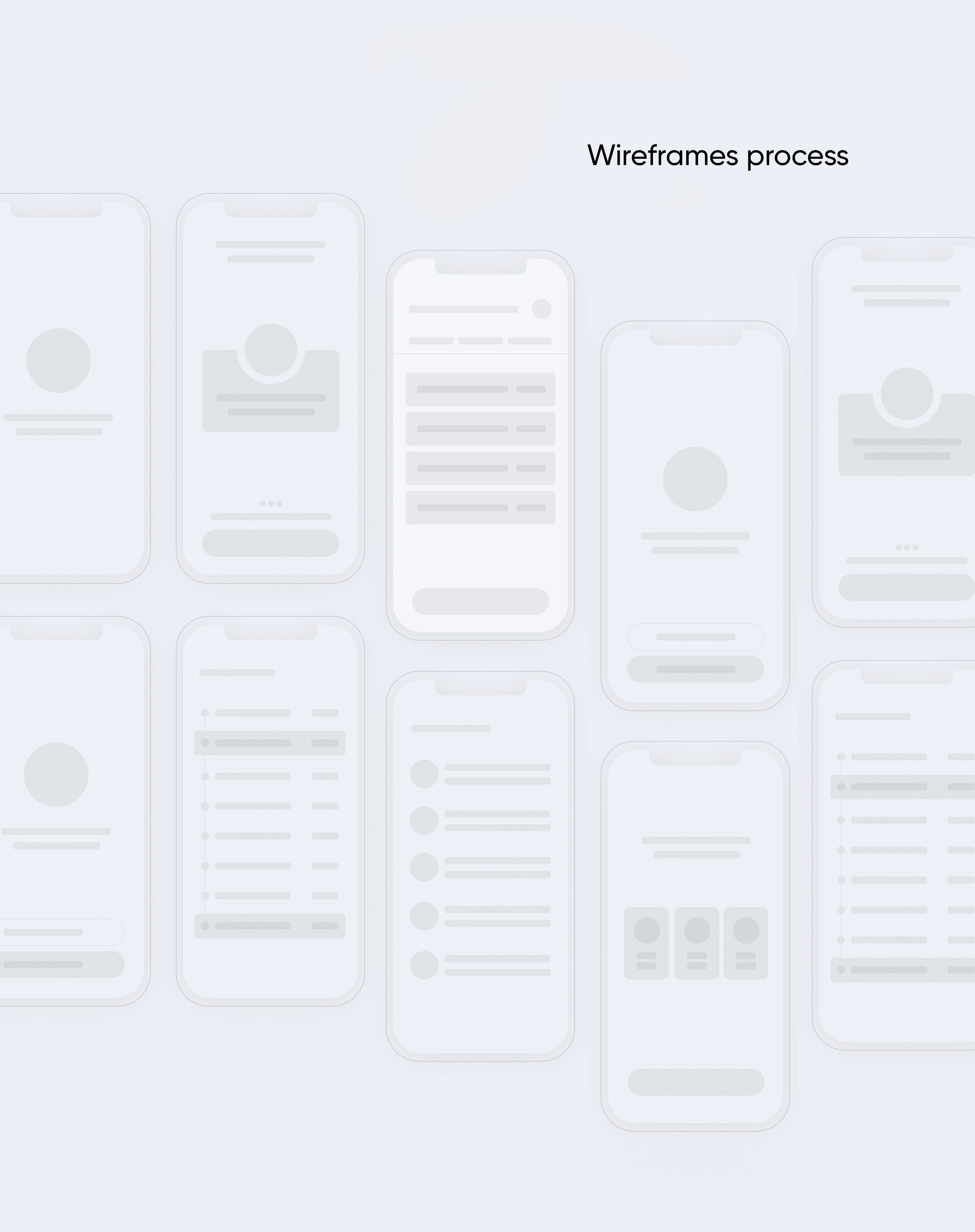
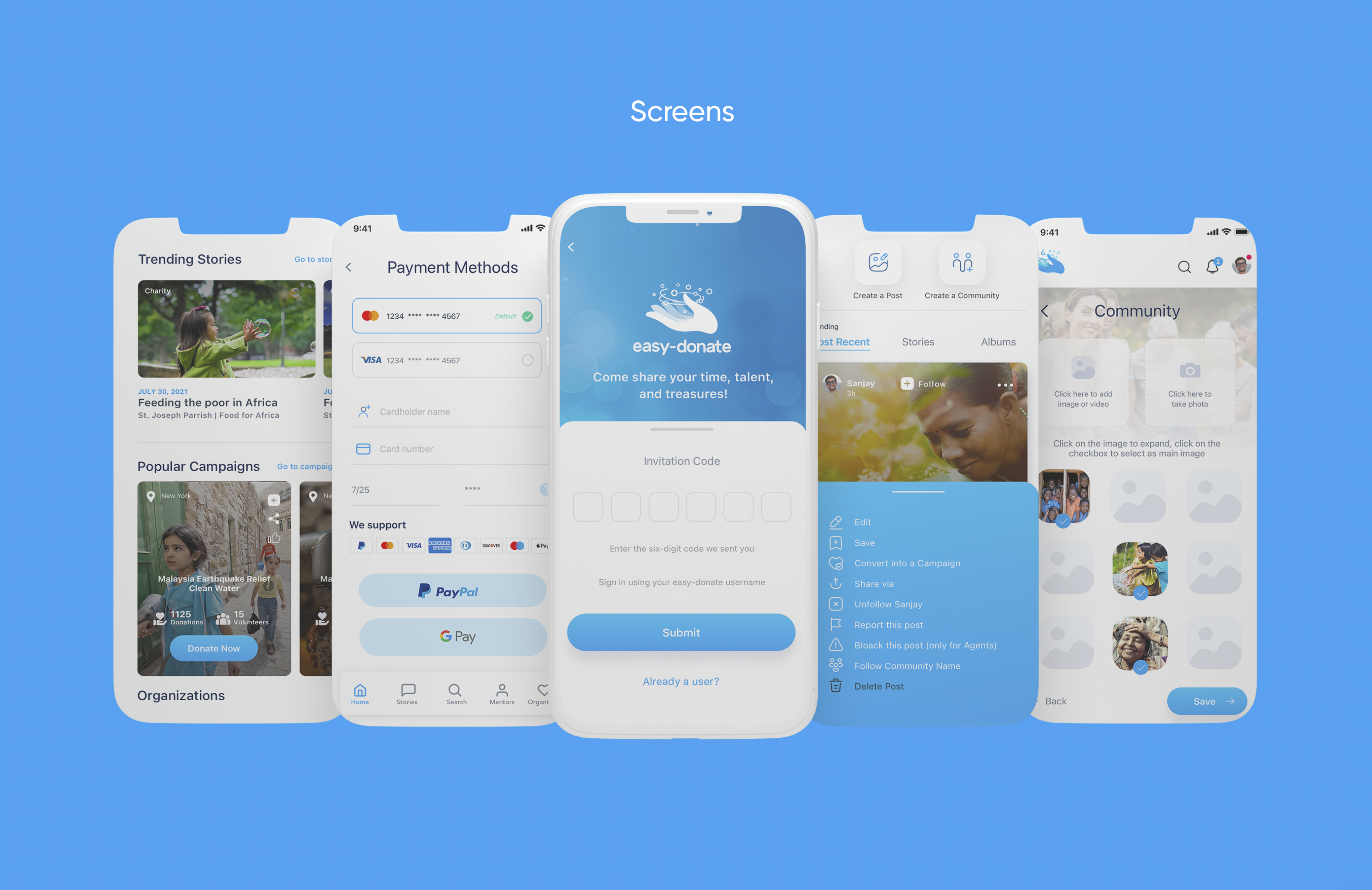
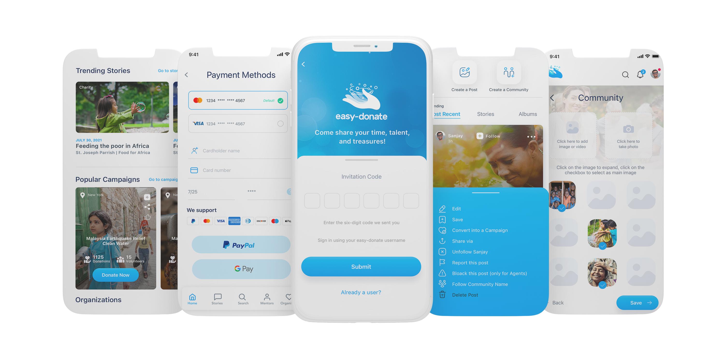
The project covered core journeys, states, variants, internal views and every scenario needed to support a complete experience ready to grow.
The interface balances emotion and function through visible buttons, simple hierarchy, clear messages and easy-to-understand navigation.

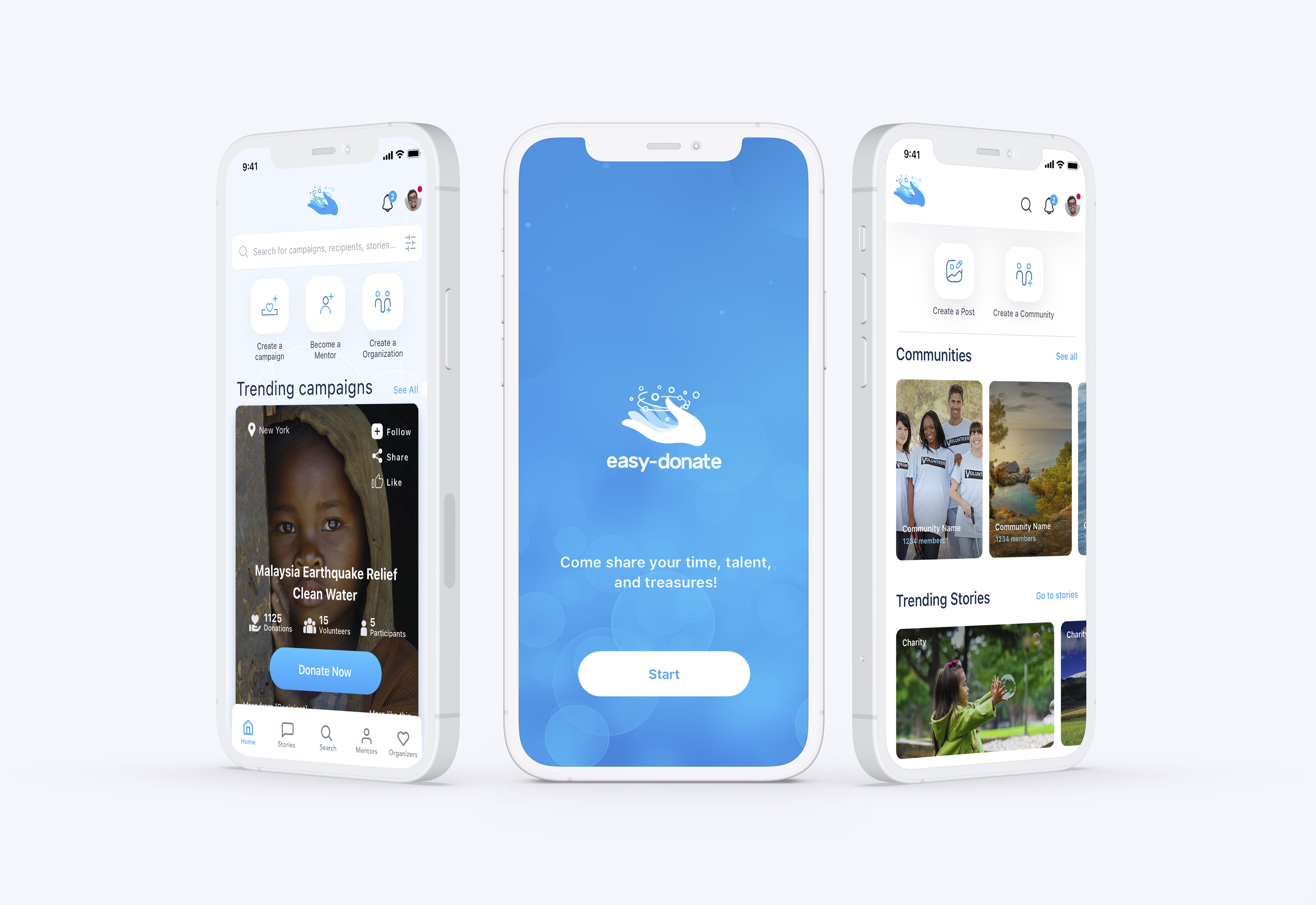
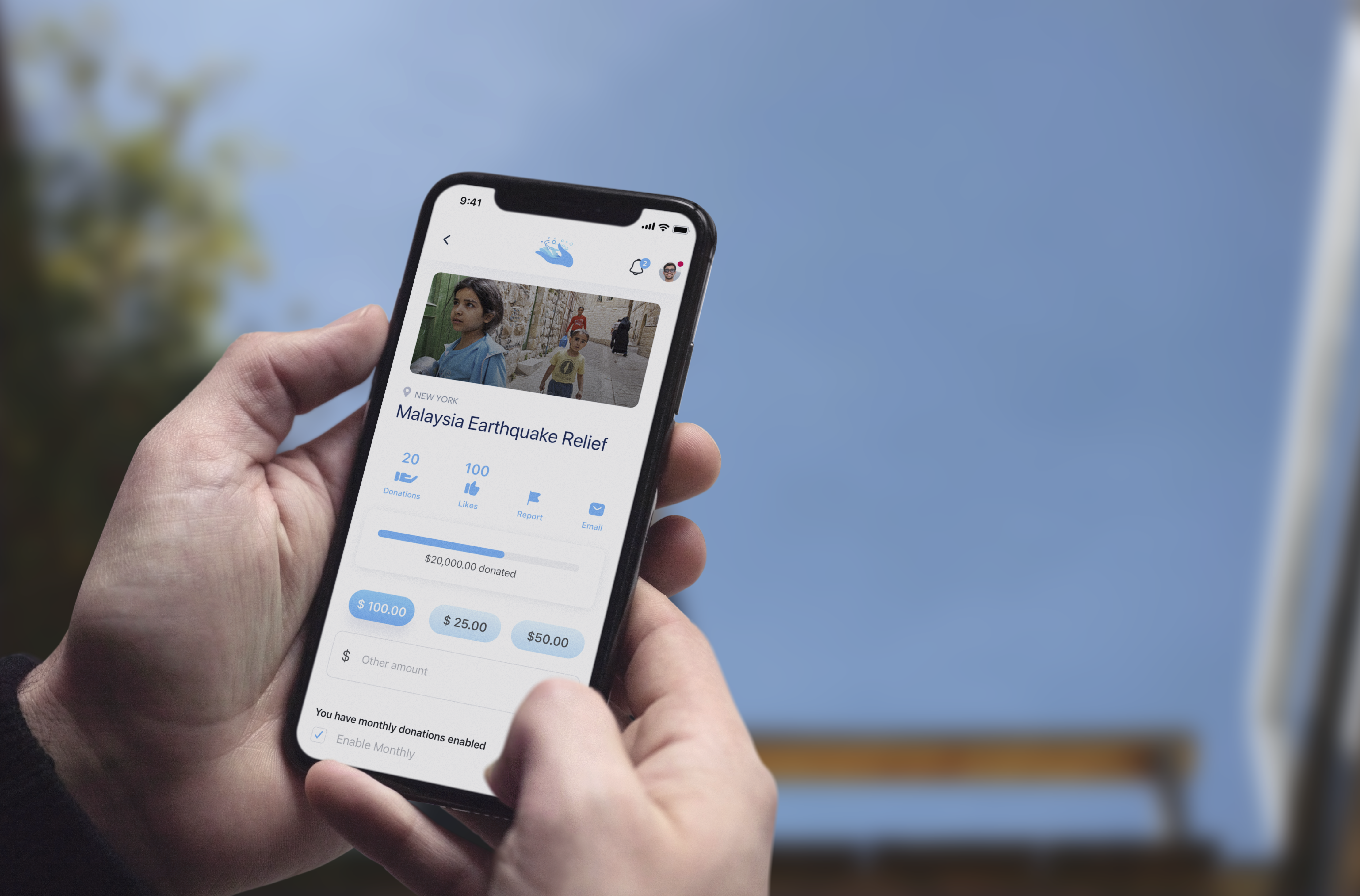
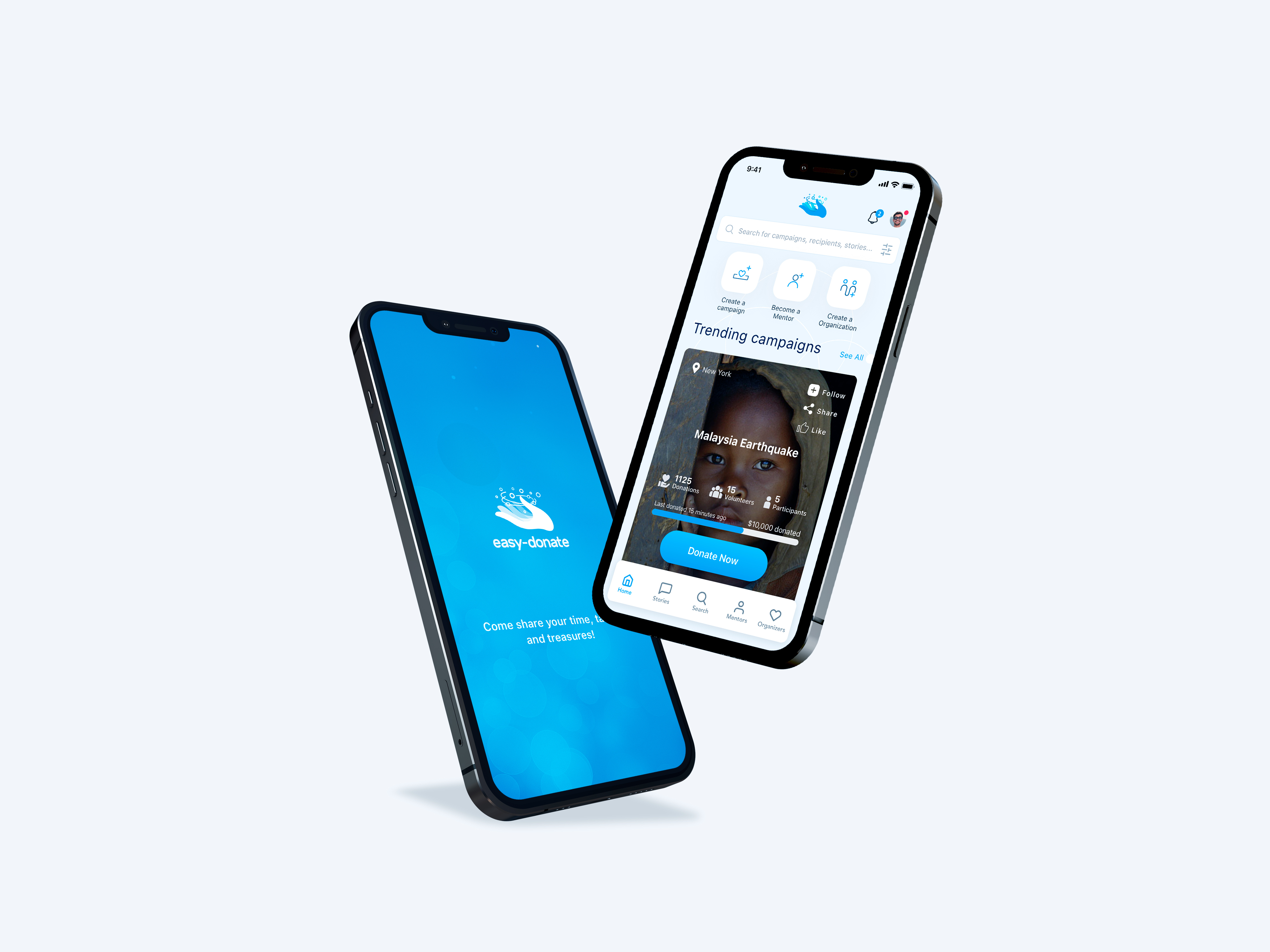
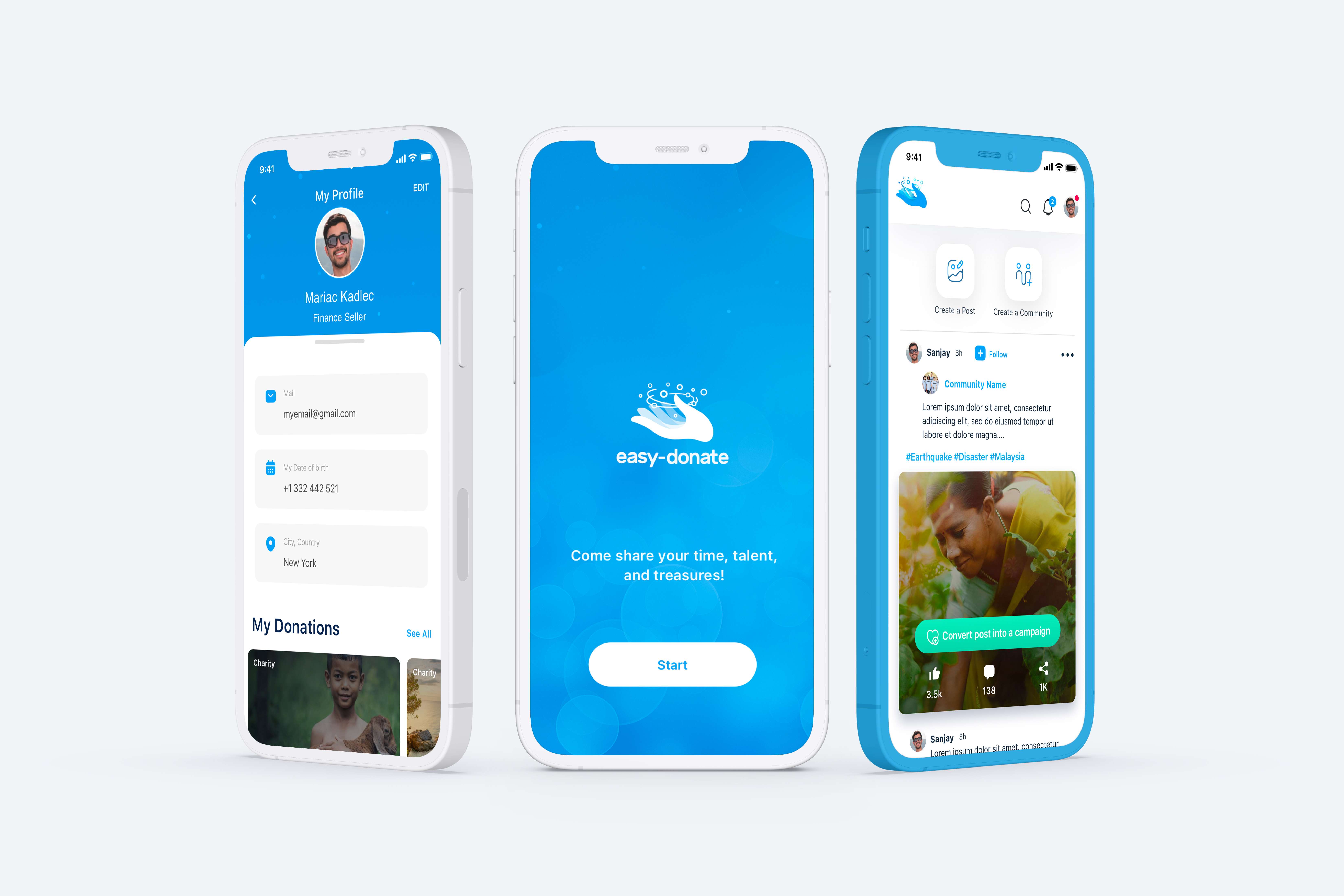
We built reusable logic for buttons, forms, cards, iconography, navigation, messages and content structures.
This foundation connected UX, UI and identity so 110+ screens could feel like one integrated experience ready to evolve.
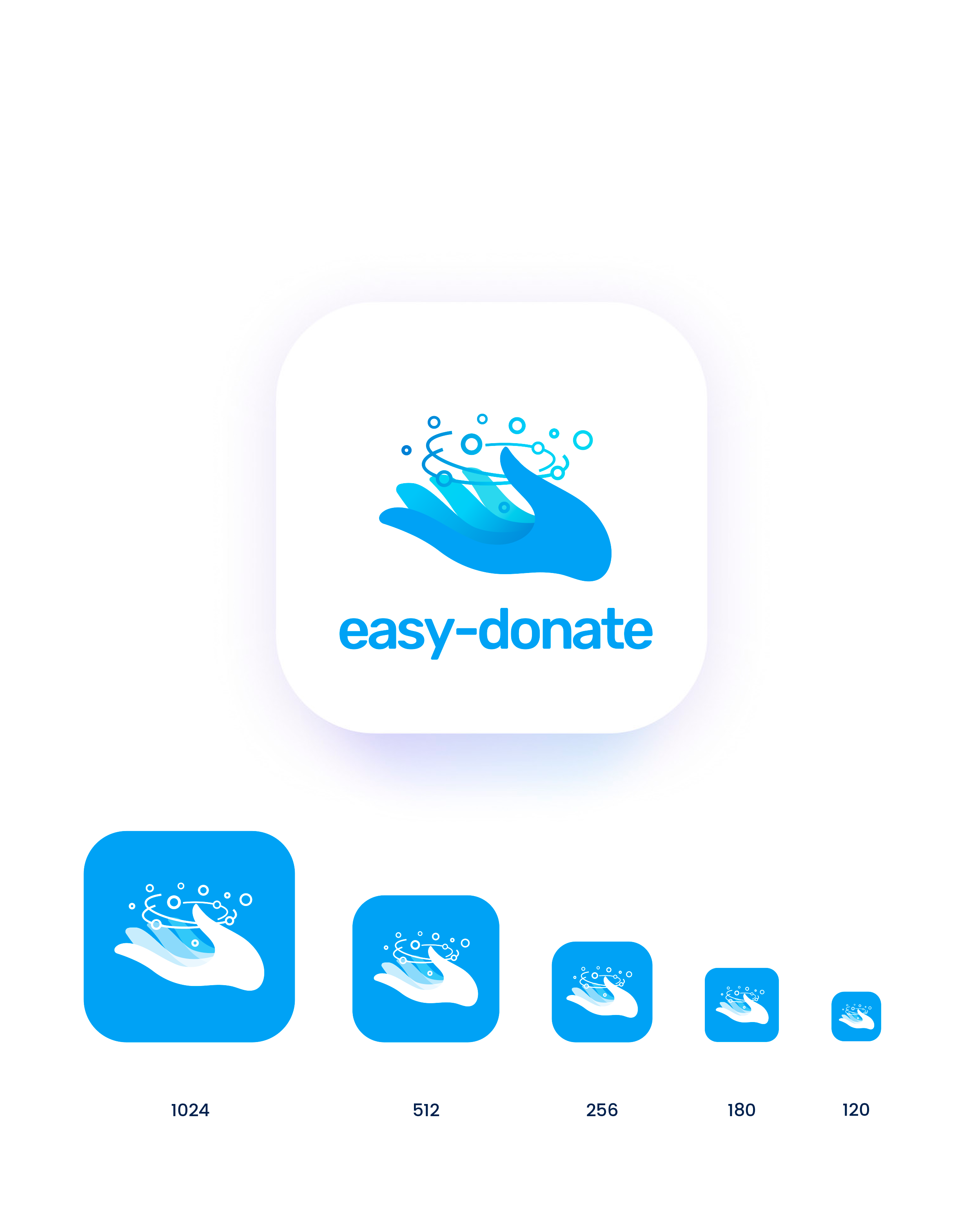
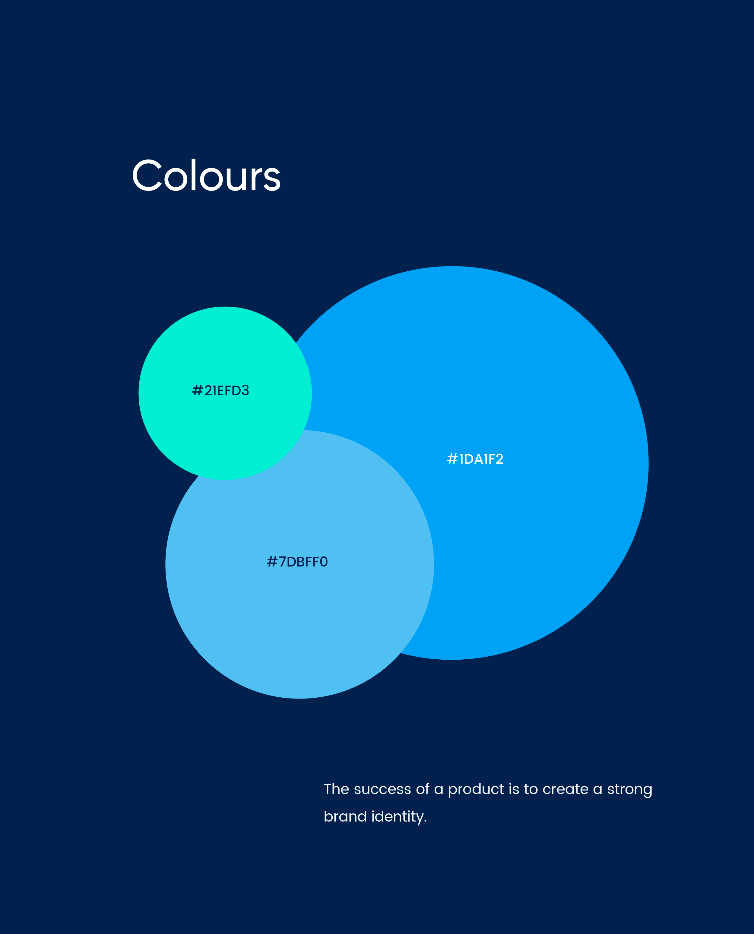
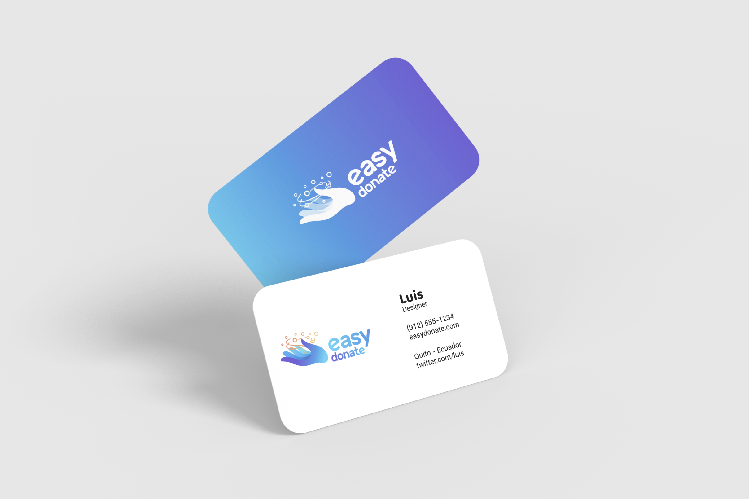
While the app was at the core, the identity gave shape to its universe. Hands holding circular lights became a symbol of help, giving, hope and human connection.
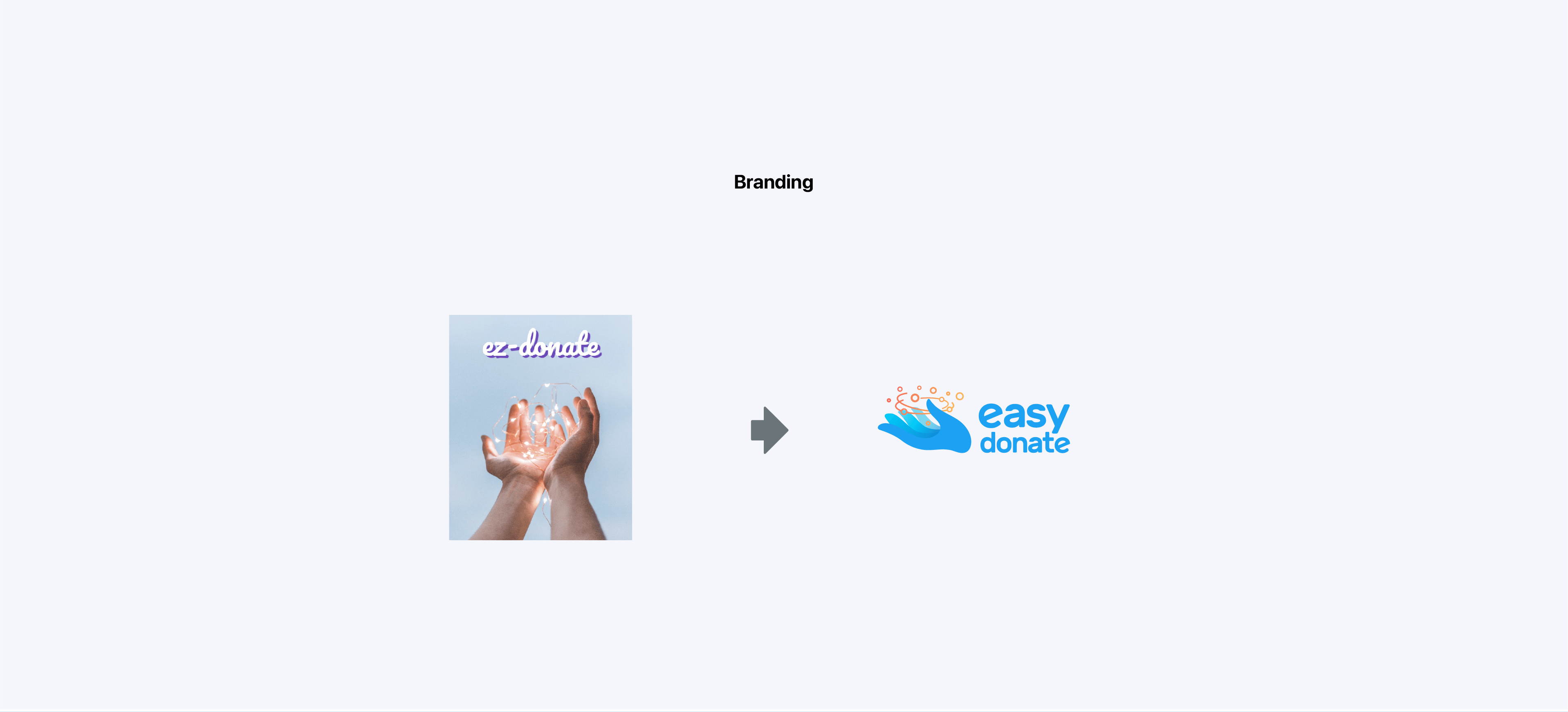
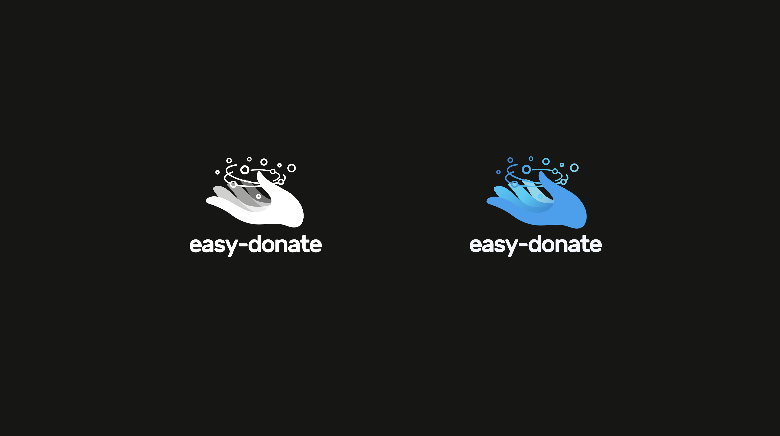
The brand needed to feel technological, but not cold; charitable, but not informal; simple, but with enough personality to be remembered.
The combination of symbol and typographic identity communicates an action that begins with one person and expands toward a cause.
The identity and UX/UI system extended into spaces that inform, manage, connect and reinforce trust in the platform.
We defined journeys, information architecture and navigation to organise the giving experience.
We built the functional foundation before visual design, validating hierarchy, content and key screens.
We designed a clear, approachable and consistent interface for a complete, large-scale application.
We created reusable logic for components, forms, navigation, states and messages.
We translated hands, light, help and human connection into a recognisable identity.
We extended the identity and experience into product management and its web presence.
The greatest challenge was turning a charitable idea into a broad, organised and easy-to-use digital product. Every visual and functional decision was designed to support the user from initial intention through to final action.
Organised journeys help users move forward with ease and confidence.
Scenarios, states and variants designed as one connected experience.
The mobile product guides the identity, dashboard and web experience.
An identity that turns help, light and generosity into an approachable symbol.
One visual logic for the app, dashboard and website.
The UX architecture turned a broad platform into an easier experience to understand.
More than 110 screens created a strong foundation for the product’s growth.
Flows, wireframes and UI decisions simplified the giving journey.
The visual direction reinforced ideas of help, hope and human connection.
The app, dashboard and website share one visual and functional logic.
UX/UI design, mobile app, wireframes, flows, UX architecture, visual system, logo, branding, dashboard and web design.
Adobe Illustrator, Adobe XD, Figma, Adobe Photoshop and UX/UI prototyping tools.

“Working with Luchini and part of his team was a brilliant experience. They handled the complete easy-donate identity—from logo and brand through to UX/UI for our website and app. Their ability to turn our vision into a beautiful, intuitive platform reflects the quality standard LIMINAL Design leads with today. Highly recommended!”
Founder / Advisor at Easy Donate
“Easy Donate was a project where product design was truly at the centre.
Beyond the logo or website, the principal challenge was building a complete application: structuring flows, making experience decisions, designing more than 110 screens and making an act as human as giving feel simple, clear and trustworthy.
It was not only about designing a beautiful app, but building a platform capable of making giving feel easier, clearer and more human.”
Branding, UX and Product Designer at LIMINAL
Easy Donate evolved from an initial idea into a complete digital ecosystem: mobile app, identity, dashboard and website.
The project created a clear, human and scalable experience ready to connect people with causes intuitively and reliably.
Purpose-led digital product
If your product needs clarity, structure and a strong visual identity, LIMINAL can turn a complex idea into a simple, trustworthy and memorable experience.
Let’s talk about your project